Dev Diary: Arcana Card Evolutions
Meromorph Games
One of my favorite pastimes is looking backwards from the finish line and reviewing the creative evolution of a project over its lifespan. For every project we complete, there are 20 false starts or abandoned wrecks. The project itself can morph wildly during its lifespan; sometimes it's hardly recognizable by the end.
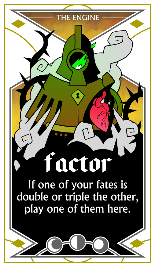
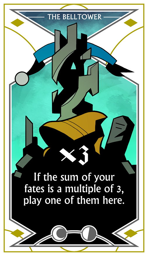
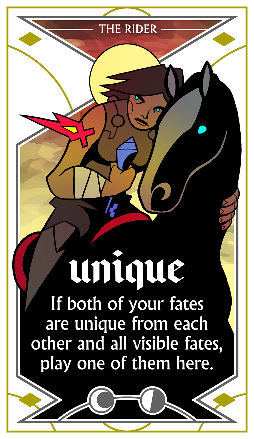
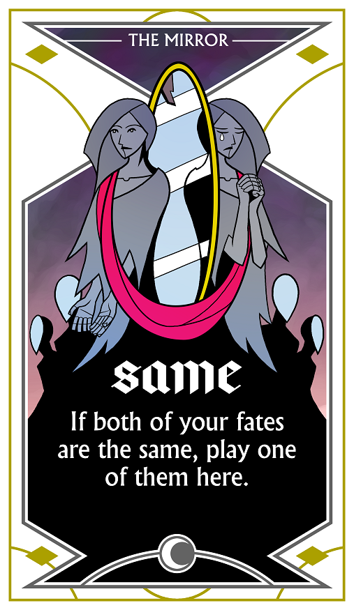
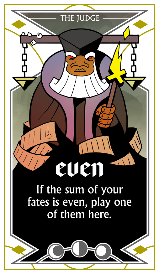
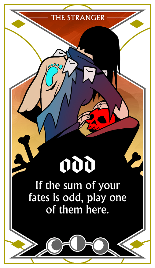
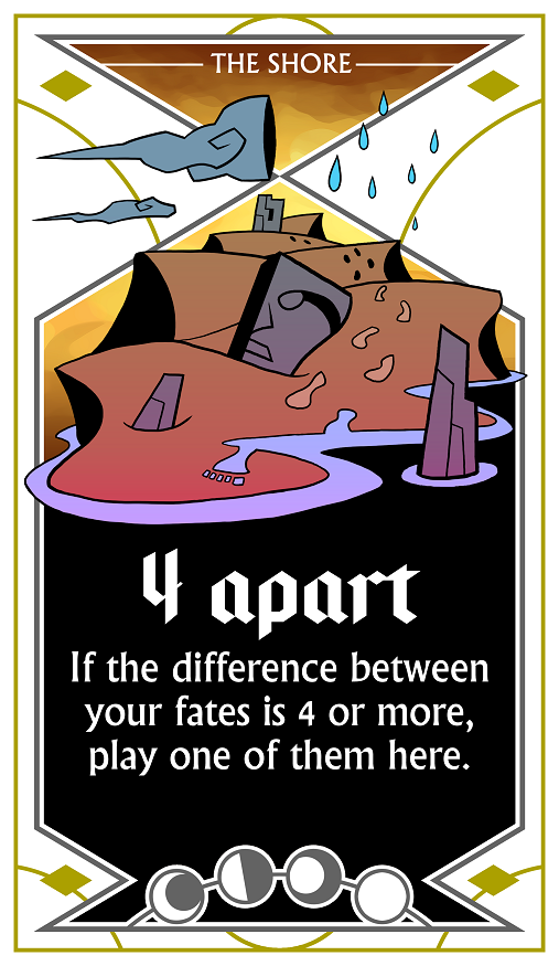
The Shipwreck Arcana has, in some ways, remained stable. It wasn't our first prototype of a cooperative deduction game, but when we came up with this particular ruleset, it didn't change much. It always had:
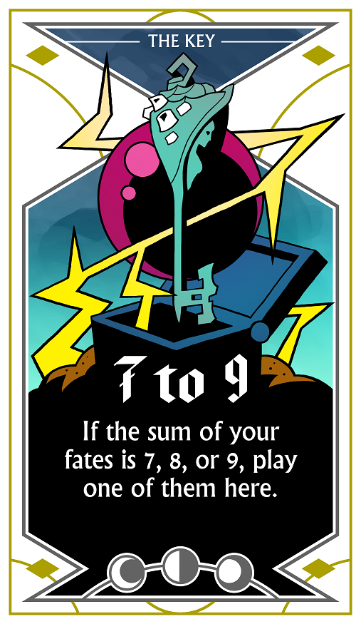
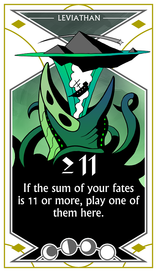
- cards with "Play here if..." rules;
- the "Draw 2, play 1" turn order;
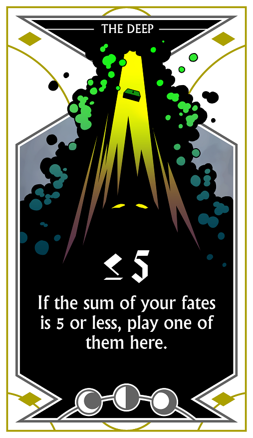
- values in the range of 1-7 (3 of each);
- victory and defeat tracks capping out around 7.
That pretty much describes the final game. So where was the evolution found? Primarily: the theme.
This is what an arcana card looked like originally:
Sorry, did I say arcana card? I meant fate token. That's right, in the original theme, the arcana cards were "wishers" (kings and queens) and each wanted their wishes granted by certain types of genie. Instead of moons, they had lamps representing how many wishes they wanted fulfilled. Meanwhile, the fate tokens were actually an entire deck of genie cards, with the more powerful genies granting more wishes. Once a wisher was satisfied, they ran off, freeing the genies who had served them; as you can see, the faded powers of the final game are found here on the genie cards instead of the wishers.
Why did we change? Well, the theme didn't fit flawlessly. You could sort of explain it to yourself in a way that felt logical, but it wasn't always intuitive. A good theme should help you logically understand how to play.
But a bigger reason was the decision to move the powers onto the wishers and make tokens out of the genie cards. Tokens are too small to feature any meaningful art, and the central highlight of the theme was these imprisoned-yet-tricky genies. Cutting them out sent us scrambling for a new idea. The mechanics were working well at this point, so we were in the unfortunate position of trying to find and staple a theme onto gameplay that was already done.
After a long debate, we homed in on two candidates: spies, or submarines.
In the spy version, you were trying to pass intel to your teammates using a network of covert operatives. Talking openly or failing to convey intel in time meant that the enemy had learned your plans and stymied them.
In the sub version, you were attacking enemy submarines while also trying to let your allies know what depth you were hiding in. If they could figure it out, they would join you to launch an attack on the surface. Take too long, or fail too often, and depth charges would destroy your vessels.
Matthew preferred spies; Kevin preferred subs. The spy theme made more sense mechanically, but we started exploring both. For spies, Matthew envisioned a cyberpunk agent theme, while for subs we had a vaguely "Renaissance cathedral" motif in mind: grand sunken structures drifting through the depths.
We started with subs. Here's an early mock-up, using placeholder art (I apologize for losing the artist credit):

Not our favorite card frame (spoiler: graphic design is hard!). It feels somewhat haphazard and unstructured. We tried something a bit more "game-y" defined by diamond-shaped elements:
This was a better direction, and began discussions of how to solidify the frame elements in earnest. Matthew tried an ornate off-kilter frame with the sub drifting through, while a small cutaway showed the scenery behind:

For a while, this was Kevin's favorite design, and a strong argument towards pursuing the sub theme further. However, it was ultimately sunk (ha) by an unrelated reality: drawing structures, landscapes, and vehicles is not Matthew's favorite thing. It amped up the art workload as well as the time it would take for him to get comfortable designing and drawing all of the submarine shots. While not impossible, it wasn't worthwhile given that our other avenue seemed more promising.
That brings us back to spies. Matthew wanted cyberpunk flavor dripping from the characters, but the card frame elements were up for debate. Around this time, Kevin suggested the idea of representing the cards (sub or spy) in a highly stylized way: as stained glass pictures, or, better yet, as tarot cards. While the gameplay might be "pass intel to your agent," why couldn't the gameplay component depicting your agent have an exaggerated style?
Matthew took a shot, using a placeholder character from some other random game:
And we were off! This direction appealed to both of us, and Matthew began trying to do his cyberpunk spies in this style:
...until we paused and realized that tarot could be more than just a presentation choice. After all, tarot cards have a strong association with prediction. So does our game. Could the theme be used wholesale?
Obviously, the answer was yes. Spies became cards, intel tokens became fates, and the gameplay became that of using a mystical deck to help your allies predict and avert your doom. Meanwhile, we scrapped our spy characters and started concocting tarot ones. What do real tarot decks have?
The most well-known tarot deck has a number of different suits of Minor Arcana cards (containing things like the 5 of Wands or Knight of Cups), as well as Major Arcana cards depicting a colorful cast of characters and concepts. Our deck size was definitely not going to match up, so we didn't even consider using the actual Major Arcana cards. Instead, we decided to craft our own out of names and concepts that would fulfill the same symbolic and abstract space.
Meanwhile, Matthew continued experimenting with the art. You can already see how the core frame elements have become nearly final, despite the variance in coloration and lineart styles:

This one felt too painterly, like a scene in a book. We wanted to sell the fantasy that these are actual cards from a deck in some fictional world. That means they should feel disconnected and free-floating, like the images on face cards in a regular playing card deck. We also chose to shy away from realism by selecting a flattened color palette and angular lines.
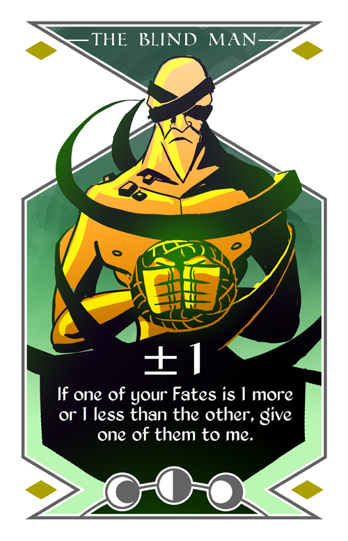
Matthew's next iteration starts to home in on familiar ground:
Colored:
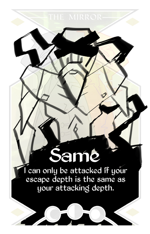
At this point, Kevin objected to the brushstroke texture being used for the character's shapes. Additionally, the absence of lineart made shading more important, which was not only more taxing for Matthew to draw but also inadvertently pulling away from the illustrated style we wanted to embrace.
Matthew first tried flattening the color shadows and textures:

...then pulled back a bit on the exaggerated proportions and lack of lineart:
...which went a tad too far. The vivid colors and angular look of the previous iteration made it distinctive, if strange looking, while this version is a pretty regular-looking dude in a pretty monotonic color.
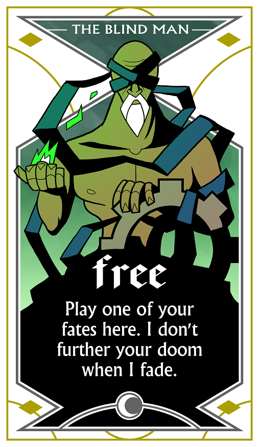
Combining aspects from both, we arrived at:

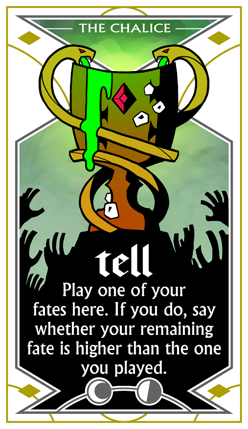
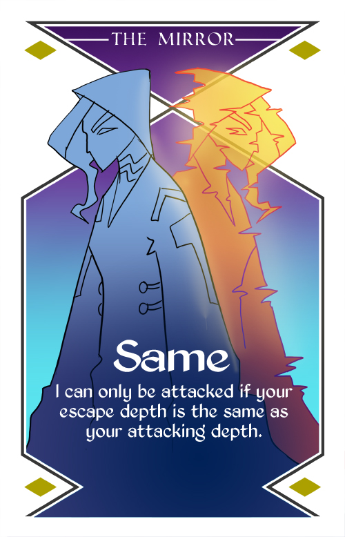
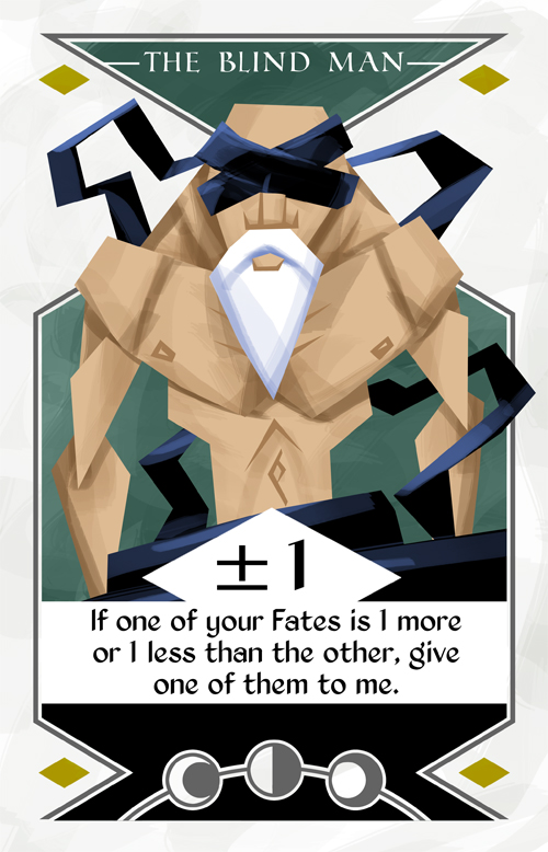
...which is the rough lineart for what became the cleaned-up final image of The Blind Man card in the finished game! A number of "rules" were derived from this card:
- Clean lines.
- Flat textures (except for backgrounds).
- Limited shading.
- Subtle use of gradients, mainly for faint lighting hints.
- Black "text box" areas that flow upwards and integrate smoothly into the main art.
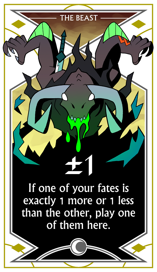
And just like that, we were off. While the style and layout elements were locked in at this point, I figured you might enjoy seeing one final glimpse into the past: specifically, the original design of The Beast:
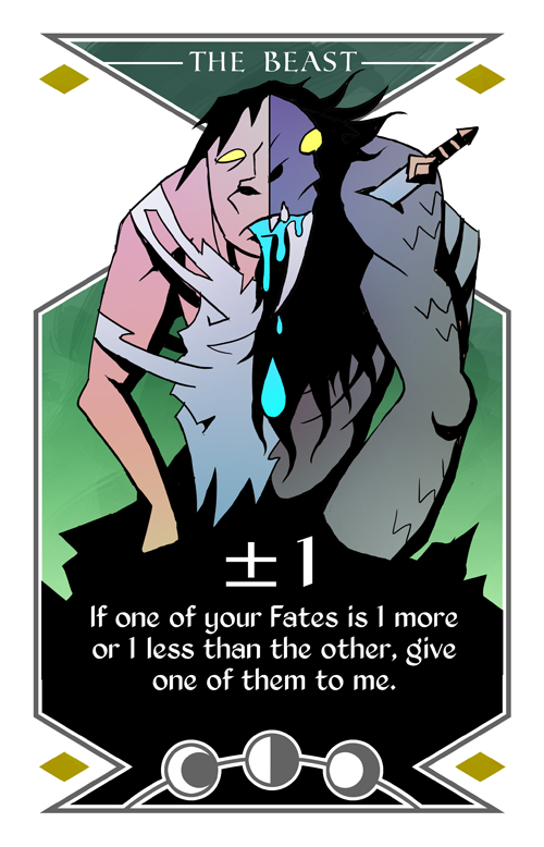
(If you prefer this to the final version, blame Kevin for rejecting it; he pushed for a less grotesque and less human direction.)
We hope you've enjoyed this snapshot into the game's art evolution! We'll have another few blogs shortly, touching on some of the game's implicit lore as well as some of the mechanical evolutions that make up the subtle distinction between the game's prototype and its final iteration.