Dev Diary: Outside the Box (1 of 3)
Meromorph Games
Boxart is the first interaction most players have with a game. Good boxart will catch your eye and entice you to pull a game off the shelf, while also providing a snapshot of what to expect from the game inside the box. Boxart is typically the last thing Matthew and I work on for a game, both because it's challenging and because we want it to be informed by the final contents within.
This article (and parts 2 and 3, coming soon) will delve into our process for planning, designing, iterating, and polishing the boxart. If you don't want to spoil the magic by seeing the creative process dissected in excruciating detail, turn away now!
The journey to create boxart for Norsaga: Odds and Endings began by going back to the beginning and examining the boxart from our first Kickstarter games: Norsaga and its first expansion, Into the Myths.
The original Norsaga box art.
For Norsaga, we wanted the boxart to focus on the storytelling flavor, as well as the emphasis on larger-than-life, semi-fictional characters. We chose a scene facing the audience, where the emphasis is not on the storyteller (we only see his back) but on the characters he weaves into his tale.
By the time we created this, we'd done a lot of work to establish the visual langue of Norsaga, so we knew that the central figure would be a skald. We chose to make the character lack any features which might align him with a particular color, to preserve the sense that he's outside the story. We eventually captured this character in promo card form as the uncolored/wild-colored wanderer skald, Skurl Gylfinning.

Promotional art for the wanderer skald, Skurl Gylfinning.
Notably, we chose to have Skurl's card art reflect the same scene as the boxart, but from the audience's perspective. This same approach also informed our creation of the boxart for Into the Myths and its central character, which once again featured a skald with no specific color affiliation.

The Norsaga: Into the Myths boxart.
This time, due to the smaller tuckbox, we were unable to display a swath of fictional characters, and instead focused on the new elements for the expansion: a host of half-seen fae characters, emerging from the mists. The general pose and framing are still similar, with a focus on the character's back and the scene before them.

Promotional art for the legend skald, Egretta Greyhame.
As before, we took this scene and fipped the POV around when creating a promo card for the character. Egretta Greyhame became a legend skald. Where other legends featured the silhouettes of the four Norsaga gods in their backgrounds, Egretta features a different -- but equally ominous -- saga behind her, in the form of the gnawing dragon Natterhog.
So, where do we start when it comes to giving Odds and Endings the same treatment? First we discussed the color palette we wanted for this boxart. Norsaga is darker with blues and a grey stone logo, while Into the Myths uses a palette of white and teal. Since Odds and Endings is our final expansion and deals with the Ragnarok-style conflict between gods and ettins, it felt appropriate to go with a darker approach. We began with an obsidian-colored logo:
Original Norsaga: Odds and Endings logo design.
You may notice that this isn't quite the final logo. While the first two games used solid colors, we eventually mixed in a fiery, apocalyptic glow within the rune-carved letters to add a touch more flavor.
Next was framing the art. Here we look for subtle patterns that emerge as all three boxes are considered in sequence, with the goal of preserving or continuing any trends that exist. We realized that boxart #1 features a level perspective with a character looking up-and-right, while boxart #2 is facing upward and the character's view is slightly left.

Boxart character and point-of-view angles. Left-to-right: original game, first expansion, anticipated second expansion.
This gave us the goal of having boxart #3 feature a downward POV, with the character turned prominently left. It's a little thing, but it can help the three boxes feel like they tell an ongoing and intentional story when viewed together, much like a triptych.
What character would boxart #3 feature? The answer had to be a skald, and likely a non-colored promotional skald, meaning one we hadn't already designed for the expansion. Parts 2 and 3 of this blog article will go into depth on how we created the immortal watcher Donwen, so we'll skip over that for now.
Once we had a prototype character and a general "camera angle," we needed a scene. The expansion's overall flavor has solidified around a central conflict: mortals taking up enchanted arms to join the fray against a backdrop of gods and ettins waging apocalyptic battle. We chose to have Donwen looking on as this battle took place in the background.

First boxart sketch, demonstrating early character design and point-of-view facing the upper left. Background scene would have eventually featured a warring god and ettin.
Before Matthew even sketched in the god and ettin, we decided there were some issues with this approach. For a character to be standing idly in the foreground while a huge battle wages behind her seemed anticlimactic. Donwen is a passive, emotionless bystander. We wanted her (and the viewer/player) to feel that they were stumbling into something exciting and dangerous, rather than simply observing from a distance.

Second boxart sketch, featuring broken bell. Point-of-view angle has been lowered slightly.
In the second sketch, Donwen is now climbing over a broken bell -- her original musical instrument -- to gain a vantage point for the battle. This better conveyed the danger and destruction of the background fight, but still felt somehow off. In particular, placing the bell front-and-center leads to questions about its importance. Does it matter in the grand story of Odds and Endings? Not a lot, but making it a random central fixture of the boxart says otherwise.
We decided to try a different approach. Instead of watching a fight in the background, what if Donwen were viewing it as depicted on a mural, carved into the bell's surface? In essence, Donwen -- a storyteller -- is stumbling across a depiction of the Odds and Endings story.
Third boxart sketch, refactoring the previous elements to focus on the bell.
I, in particular, was a fan of the mural approach, but felt that the bell continued to add unnecessary detail and confusion into the scene. When the mural is depicted on a bell, the viewer's first question is "Why draw this on a bell?" rather than "What story is this a drawing of?" Using the power of Microsoft Paint, I sketched out an alternative version of the mural scene, removing the inessential elements and simplifying the character's role and placement within the scene.

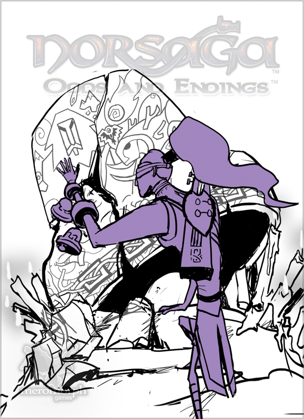
Concept art for alternative boxart.
Although crude, concept art like this plays a big part of the Norsaga creation process, giving Matthew material to iterate and explore off of. In this case, his first rendition of the concept already held promise:

Fourth and final boxart sketch, featuring updated POV, posture, and mural.
Now the focus feels more appropriately balanced around the character and their interaction with the mural. With no extraneous details as distraction, the mural's story has become important again, to both the character and the viewer. The candles tie back into the character's skald heritage, as well as the candles found in both previous boxarts.
All in all, we felt comfortable proceeding in this direction, and Matthew began working to finalize it into workable lineart.

Draft of uncolored final boxart.
Although uncolored, this draft served as the working base for all subsequent iterations.

Draft of colored final boxart, without lighting or shading.
Next, the general color palette is filled in. We knew we wanted to go with darker colors, a mixture of purples, browns, and reds, as a contrast to the earlier boxarts. This dovetailed with Donwen's design as a skald who isn't directly affiliated with any of the four major character colors, meaning her design had to incorporate only purple and neutral colors.

Draft of final boxart with purple lighting.
This is the first "final" draft of the boxart. Matthew finished the art by adding light and shadow based on the scene's primary light source: the enchanted candles. While well-drawn, this piece led to further discussion, as I felt that it was missing something. There was an odd separation between the heavily purple light and the pale brown wall. Something felt out of place.
We decided to try altering both the color and intensity of the light, providing much more intense shading on the background wall and lending the composition a greater sense of place. This is a candlelit mural in a forgotten cave within the earth; it should feel dark, foreboding, ancient.

Final boxart, featuring warm lighting.
You can see for yourself how the final interpretation turned out!